GoodRx: Condition-based subscriptions
How do you bring a brand promise of transparency and credibility to a category full of confusing pricing and questionable claims?
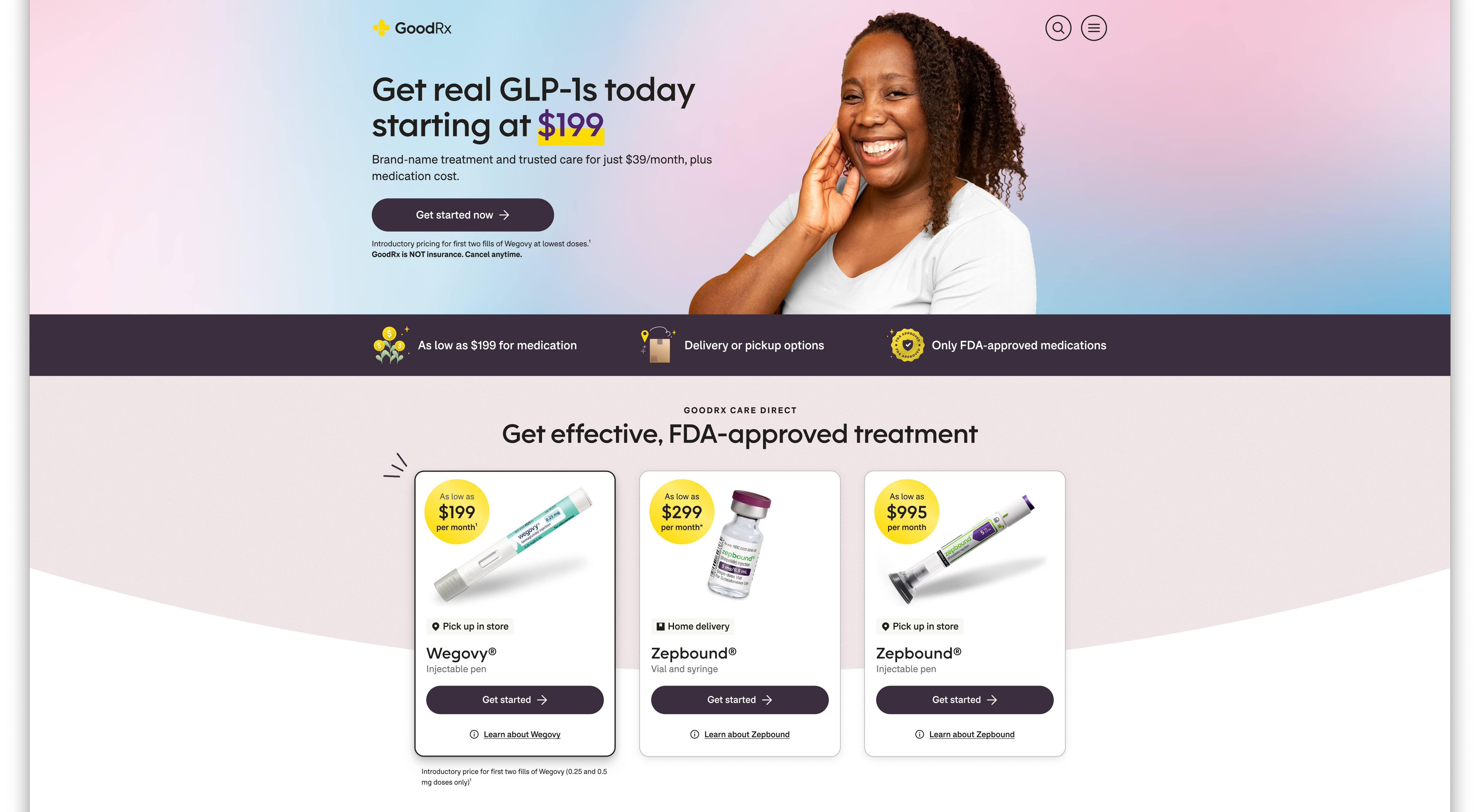
- On the landing page that would be many people's introduction to the program, I worked with my product and visual design partner to develop a clear pricing graphic.
- I suggested we create two distinct cards just before checkout showing the treatment program and medication as their own charges, with bullets showing exactly what was included with the membership.
- At checkout, the treatment was the only thing we'd charge for, so it was shown as "Weight loss treatment" again, with a subtitle that said "Initial visit and ongoing support." Below that, I wrote a line explaining that if prescribed, medication would be charged separately.
- Make sure the voice felt more like GoodRx while still maintaining an air of clinical seriousness (ex: changed references to "GLP-1 agents" to "GLP-1 medication")
- Correct inconsistencies in how conditions, medications, and therapies were mentioned (ex: generic vs. brand name conventions)
- Eliminate unnecessary or duplicitive questions
- Reformat question logic trees to map correctly to question and answer types in our back end
Overview
GoodRx saw an opportunity to enter the business of direct-to-consumer healthcare and medication subscriptions.
There were already a few well-established players in the market of "condition-based subscriptions," and more entering all the time. We knew we would have to differentiate ourselves in this increasingly crowded area.
After careful competitive and internal analysis, we decided to lean heavily on our brand strengths in trust, reliability, and affordability.
What we built
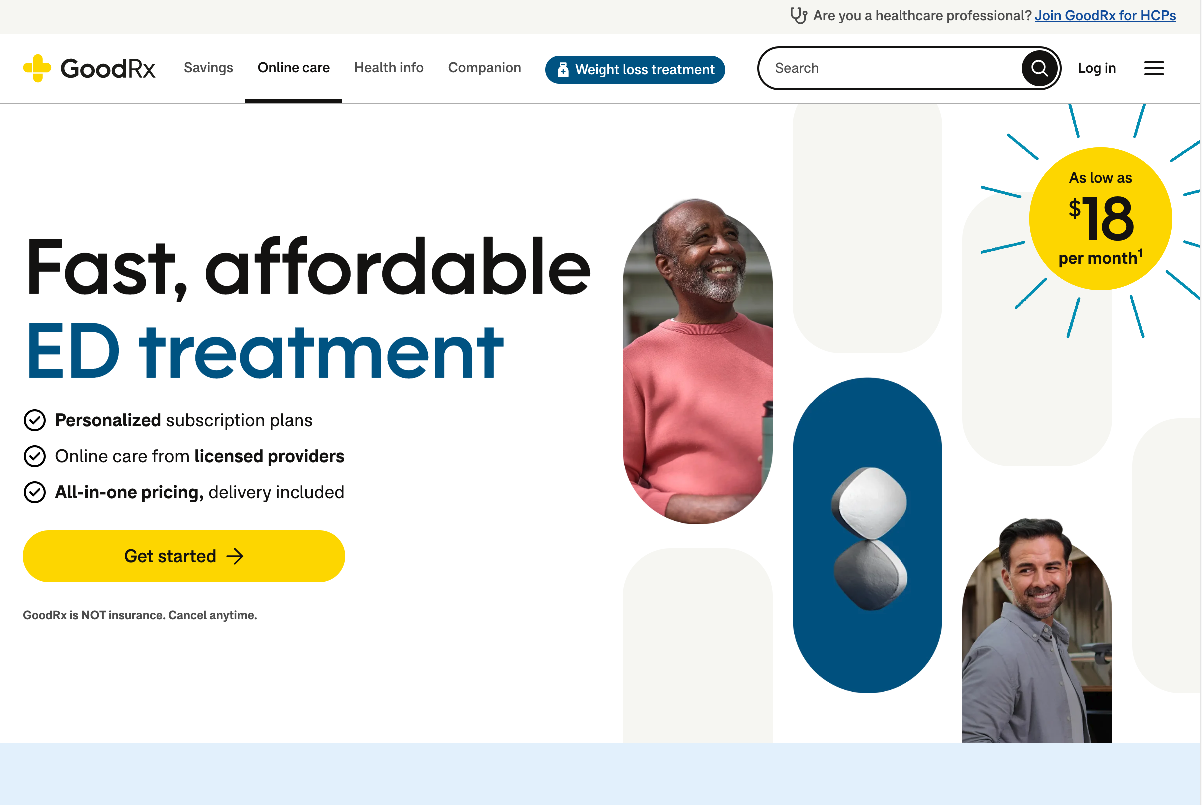
We launched three subscription memberships in 2025, for erectile dysfunction, men's hair loss, and weight loss with GLP-1s.
I wrote nearly all the content for the ED and Weight Loss programs, which included marketing pages, FAQs, intake questionnaires, error and ineligibility messages, account management screens, and more.
Content considerations
Communicating complex pricing
Our weight loss subscription presented a unique challenge from our previous offerings. We charged a monthly subscription fee for the ability to see a clinician, get a prescription, and continue having regular check-ins and as-needed visits if members were experiencing side effects. Unlike the other subscriptions, the medication was charged separately, and not even by us if it was being picked up at a retail pharmacy.
We promised transparency, and needed to communicate that our baseline subscription fee of $39/month did not include medication. The reverse was also true—if you saw that the medication you were interested in was $299/month, you still needed to know that the membership cost an additional $39/month. We knew from research that people weren't always aware that monthly check-ins are required to manage dosing as you ramp up to your top dose.
To further complicate matters, competitors frequently sold compounded GLP-1 medications for an all-in-one package fee. This made it hard for consumers to comparison shop.
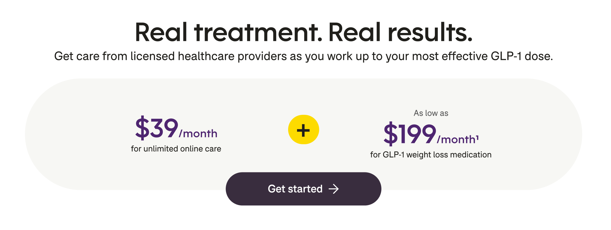
To combat confusion, I took a multi-pronged approach to the pricing communication.
Balancing clinical validity with user comprehension
Telehealth services for these subscriptions are provided by a third-party partner who already had default questionnaires for these types of visits. These questionnaires had to be overhauled significantly for style, consistency, and to adapt to the mechanics of this program.
Additionally, we had to ask some questions that needed to be passed to our fulfilling pharmacy. All of this needed to feel seamless to someone signing up for care.
I started a shared document where I carefully marked up the provided questionnaires to:
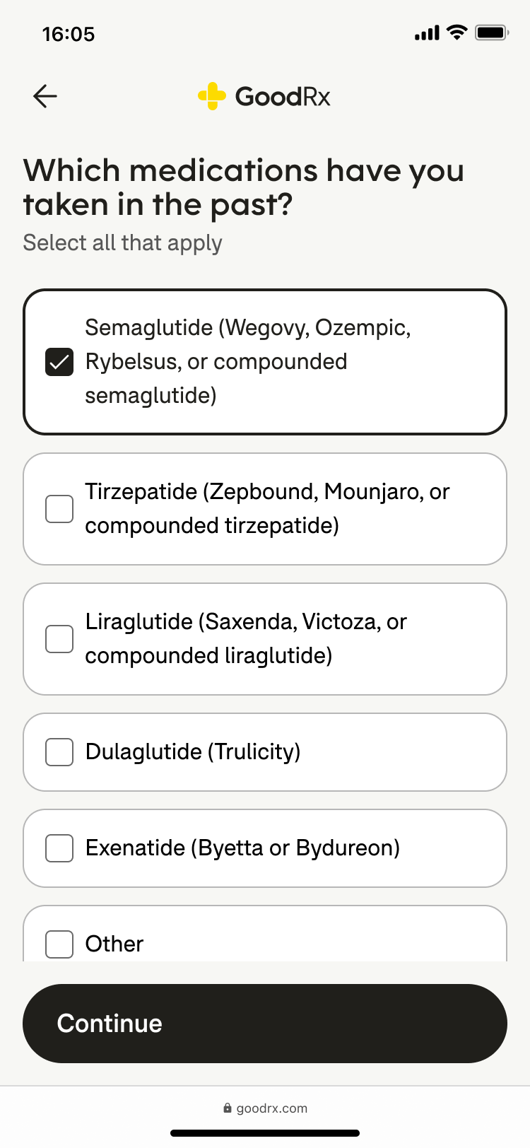
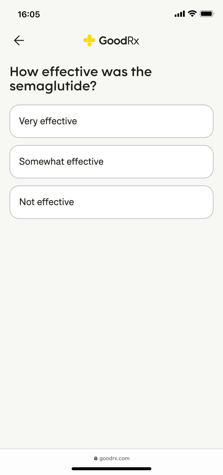
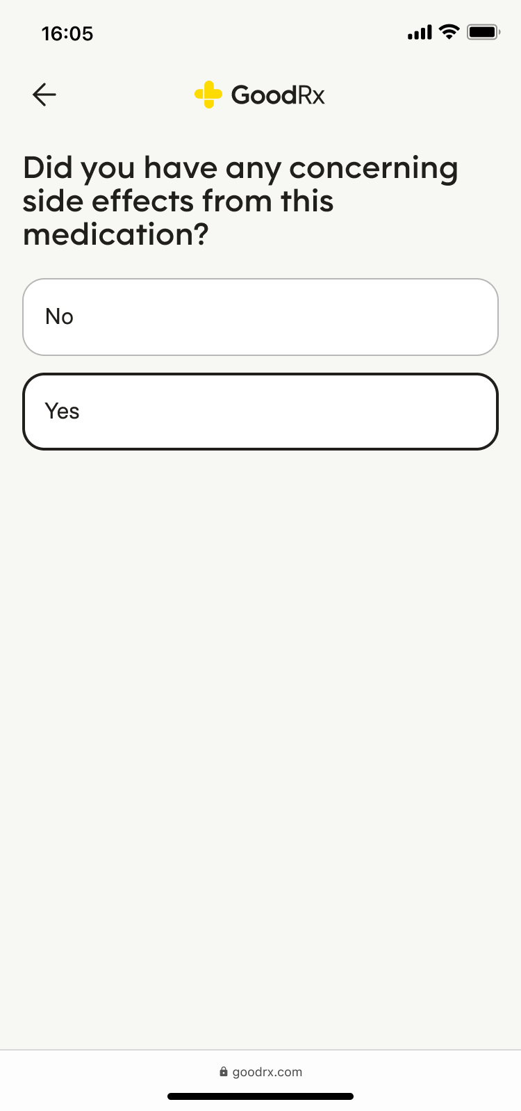
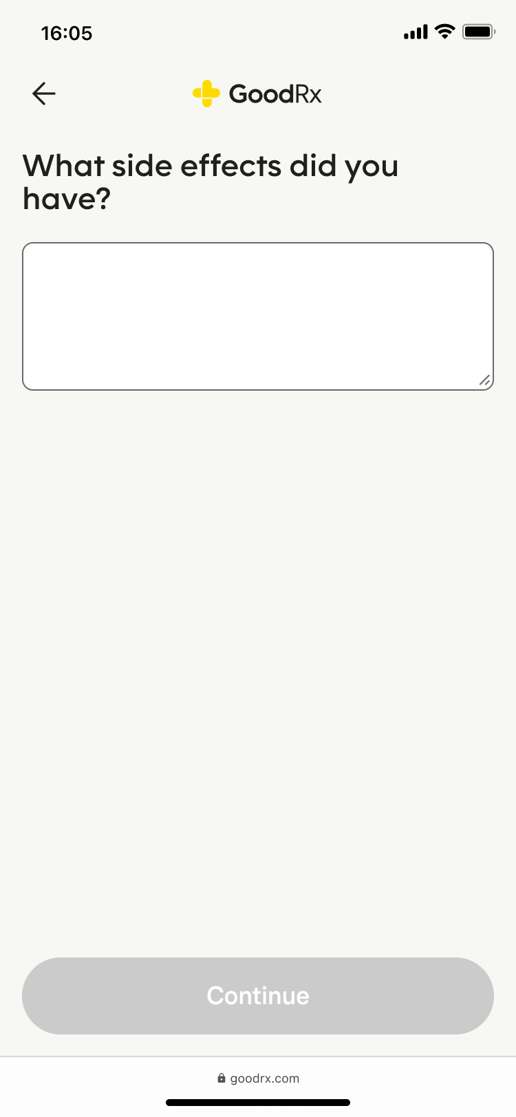
I vetted these changes with internal stakeholders for feedback and alignment, then shared it back with the telehealth and pharmacy partners to ensure I hadn't overstepped or changed any of the clinical meanings. I also collaborated with engineering to make sure the questions were all mapped appropriately.
Naming
At the very beginning of the design process, I knew we would need to be strategic about what we called these programs. Knowing that our recently-hired head of brand was still getting their bearings at the company, I took the lead and wrote up a set of questions and considerations about brand hierarchy, our desire to name the programs individually and/or as an umbrella program, as well as naming explorations to kick off the conversations.
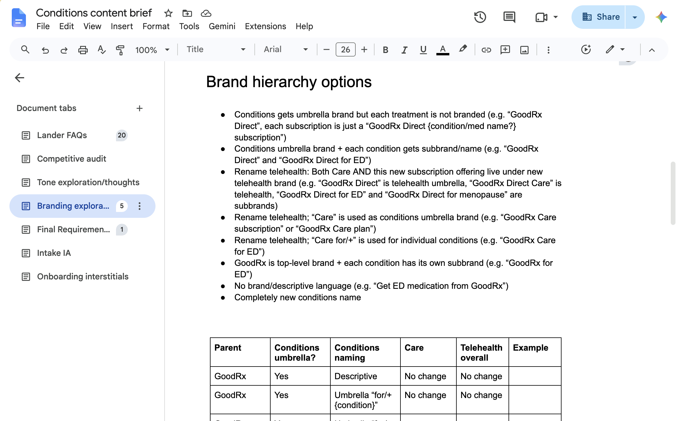
I also sketched out a full spectrum of name and hierarchy options and generated a set of initial name candidates, along with pros and cons. This got the conversation rolling faster, and the brand team generated ideas based on my work. We agreed in the end on "Care Direct" as the program name, to be used only where necessary to group the subscriptions, and a convention of "GoodRx for {condition or goal}" for the subscriptions where necessary (ex: "GoodRx for Weight Loss").
Results
We delivered three end-to-end subscription programs in a single year, in a space we hadn't been operating. Subscriptions revenue increased by 39% in the first half of 2026 based largely on the weight loss subscription.